Table of Contents
Understanding price movements in digital assets is like navigating with a map. Traders rely on visual data to predict trends and avoid pitfalls. Billionaire Michael Novogratz proves this skill isn’t age-bound—he entered the market in his 50s and succeeded.
Technical analysis turns raw numbers into actionable insights. Patterns reveal entry points, stop-loss levels, and potential breakouts. Just as a hiker studies terrain, investors decode candlesticks and indicators.
This guide breaks down foundational concepts before exploring chart types. Whether you’re new or refining strategies, these principles apply universally.
Why Learning to Read Crypto Charts Matters
Visual data transforms raw numbers into strategic advantages. In technical analysis, charts serve as the backbone for identifying opportunities and managing risk. Over 70% of professional traders rely on them daily, according to industry studies.
The Role of Charts in Technical Analysis
Charts translate price action into recognizable patterns. These formations—like the head-and-shoulders—signal reversals with 85% accuracy when paired with volume spikes. Traders use them to set precise stop-loss or take-profit orders.
Historical data reveals 30–40 recurring patterns. Each one reflects market psychology, from panic sell-offs to bullish breakouts. This predictive power turns charts into decision-making tools.
How Charts Help Predict Market Trends
Candlestick formations, such as dojis or hammers, offer real-time insights. A double top pattern often precedes downtrends, while ascending triangles suggest upward momentum. Volume bars confirm these signals, adding reliability.
For example, a breakout above resistance with high volume validates a buy signal. Conversely, low volume during a rally warns of weak participation. Such nuances separate informed trades from guesses.
In cryptocurrency markets, where volatility reigns, charts provide clarity. They turn noise into actionable intelligence, bridging the gap between data and strategy.
Understanding Crypto Chart Types
Different chart types reveal unique aspects of market behavior. From spotting trends to filtering noise, each format serves a specific purpose. Mastering these tools enhances decision-making in volatile markets.
Line Charts: Simplicity for Trend Spotting
Line charts connect closing prices over time, ideal for identifying macro trends. However, they lack granularity—no open, high, or low data. Traders use them for quick overviews but switch to detailed formats for analysis.
Bar Charts: Detailed Price Action Insights
Unlike line charts, bar charts display OHLC (open, high, low, close) data. Each bar’s vertical line shows the price range, while horizontal ticks mark opening/closing levels. This depth helps pinpoint reversals or breakouts.
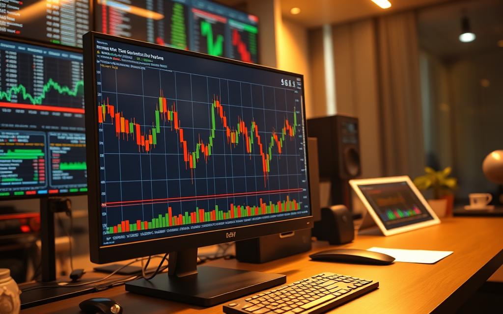
Candlestick Charts: The Trader’s Favorite
Originating in 18th-century Japan, candlestick charts revolutionized rice trading. Munehisa Homma’s system used colored “candles” to show price direction. Today, platforms like Crypto.com highlight:
- Body: Opening/closing prices (green/red for bullish/bearish).
- Wicks: High/low extremes, signaling volatility.
Heikin-Ashi Charts: Smoothing Out Market Noise
This Japanese method averages prices to filter false signals. Unlike traditional candlestick charts, Heikin-Ashi candles lack gaps, making trends clearer. Swing traders favor this for reducing whipsaws.
| Chart Type | Best For | Limitations |
|---|---|---|
| Line | Trend identification | No OHLC data |
| Bar | Detailed analysis | Cluttered in fast markets |
| Candlestick | Day trading | Requires pattern knowledge |
| Heikin-Ashi | Swing trading | Delayed signals |
Key Components of a Crypto Chart
Timeframes, price action, and volume form the backbone of effective analysis. These elements transform raw data into actionable insights. Platforms like Bybit and *TradingView* offer tools to refine these components for precision.
Timeframes and Their Impact on Analysis
Shorter timeframes (1-minute to 1-hour) suit day traders chasing quick gains. Swing traders prefer daily or weekly views to filter noise. Multi-timeframe analysis—comparing 15-minute and 4-hour charts—reveals confluence zones for stronger signals.
Price Axis and Volume Axis Explained
The price axis (vertical) reflects market sentiment, while the volume axis (horizontal) measures participation. Bybit places volume bars below the chart, highlighting spikes during breakouts. A rising price with declining volume often signals weak momentum.
How to Customize Your Chart for Better Readability
Tailor visuals to match your strategy:
- Color schemes: Use contrasting shades for candlestick bodies/wicks (e.g., green/red for bullish/bearish).
- EMA periods: Set shorter periods (9–20) for volatile assets, longer (50–200) for trends.
- Layouts: Save templates in *TradingView* for quick access to preferred indicators.
“Volume is the gasoline that drives price movements—ignore it at your peril.”
Adjust grid opacity or hide non-essential elements to reduce clutter. These tweaks turn complex data into clear signals.
How to Read Crypto Charts Using Technical Indicators
Technical indicators unlock predictive power in volatile markets. These tools quantify price movements, turning chaos into actionable strategies. From simple averages to complex oscillators, each serves a unique role in forecasting.
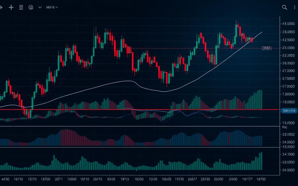
Moving Averages: The Trend Compass
Simple Moving Averages (SMA) smooth out noise by averaging prices over a set period. Exponential Moving Averages (EMA) prioritize recent data, reacting faster to shifts—critical for crypto’s 24/7 markets.
For example, a 50-day EMA crossing above a 200-day EMA (Golden Cross) signals a bullish trend. Conversely, a Death Cross hints at downturns.
| Type | Best For | Drawbacks |
|---|---|---|
| SMA | Long-term trends | Lags in fast markets |
| EMA | Day trading | More false signals |
RSI: Gauging Market Extremes
The Relative Strength Index (RSI) measures overbought (>70) or oversold (
Combine RSI with moving averages to filter false signals. A buy trigger occurs when price bounces off the 50 EMA while RSI exits oversold territory.
MACD: Momentum Confirmation
The MACD histogram tracks the gap between its line and signal line. Expanding bars indicate strengthening momentum. During trend changes, watch for histogram crosses above/below zero.
Backtesting on Bitcoin’s 2021 bull run shows MACD accurately flagged continuations when paired with volume spikes.
“Indicators are lenses—each reveals a different facet of market psychology.”
- Avoid overload: Stick to 3 indicators max (e.g., EMA + RSI + MACD).
- Optimize parameters: Use 14-period RSI and 12/26/9 MACD for crypto.
Popular Chart Overlays for Enhanced Analysis
Advanced traders enhance their strategies with powerful chart overlays. These tools decode volatility, pinpoint reversals, and validate trends. Integrating them elevates raw data into high-probability setups.
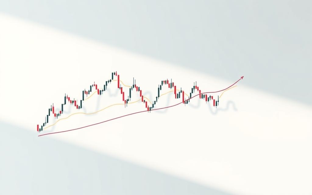
Bollinger Bands: Measuring Volatility
Bollinger Bands track price swings using a 20-period SMA and two standard deviations. Narrowing bands signal low volatility (a “squeeze”), often preceding explosive movements. ETH/USDT showed a 23% surge after a 3-day squeeze in 2023.
Widening bands indicate increasing volatility. Traders watch for price touching the upper/lower bands as potential reversal zones. Combine with RSI for confirmation.
Fibonacci Retracement: Identifying Support/Resistance
The Fibonacci retracement tool plots key levels at 23.6%, 38.2%, and 61.8% (the “golden ratio”). These act as magnets during pullbacks. For example, Bitcoin’s 2021 correction stalled precisely at the 61.8% level before rallying.
- Confluence zones: Overlap Fibonacci levels with pivot points for stronger signals.
- Extensions: Use 161.8% to project profit targets in trending markets.
Volume Indicators: Gauging Market Interest
Volume indicators like On-Balance Volume (OBV) confirm trend strength. Rising OBV during uptrends suggests institutional buying. Heatmaps reveal hidden support/resistance by highlighting high-volume nodes.
“Volume precedes price—always let participation guide your entries.”
| Overlay | Best Use Case | Pro Tip |
|---|---|---|
| Bollinger Bands | Volatility cycles | Pair with MACD for exits |
| Fibonacci | Pullback entries | Combine with 200 EMA |
| Volume Profile | Spotting liquidity | Watch for “low-volume” traps |
Recognizing Crucial Chart Patterns
Charles Dow’s century-old theories still shape how traders interpret price action today. Over 30 recurring patterns—validated by modern data—signal reversals, breakouts, and consolidations. These formations act as a shared language for market participants, from Wall Street to decentralized exchanges.
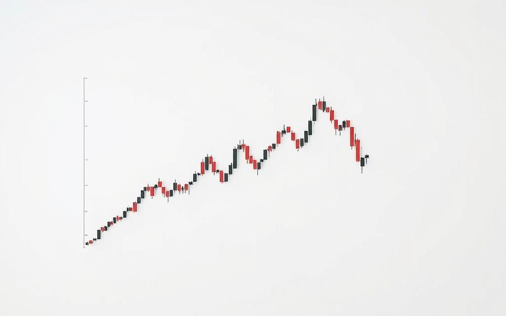
Head-and-Shoulders: Reversal Signals
This bearish pattern appears after uptrends, featuring three peaks: a higher “head” between two lower “shoulders.” The neckline breakout confirms the reversal, with a measured move target equal to the head-to-neckline distance.
SOLANA’s 2023 breakdown showed a failed head-and-shoulders—price reclaimed the neckline due to low volume. Always pair this formation with chart patterns and volume spikes for higher accuracy.
Double Tops and Bottoms: Trend Changes
Double tops mark resistance zones where buyers fail twice, often preceding downtrends. Conversely, double bottoms signal accumulation. Studies show these formations succeed 65% of the time on daily timeframes versus 52% on hourly charts.
Triangles: Continuation Patterns
Triangles form during consolidations, with three subtypes:
- Ascending: Flat top with rising lows—breakout typically upward.
- Descending: Flat bottom with lower highs—bearish continuation.
- Symmetrical: Converging trendlines—breakout direction determines bias.
Channel Up patterns show 73% reliability when volume confirms the breakout.
Wedges: Bullish and Bearish Formations
Falling wedges (bullish) slope downward against the trend, while rising wedges (bearish) slope upward. The key difference? Wedges show converging trendlines with steeper angles than triangles.
“Patterns reflect collective psychology—learn them, but always question the context.”
For reliability, prioritize weekly chart formations over 4-hour setups. Combine with RSI divergences to filter false signals.
5 Professional Tips for Effective Chart Reading
Professional traders elevate their game by integrating platform selection, indicator synergy, and rigorous testing. These refinements transform raw data into high-probability trades. Below are five actionable strategies to sharpen your analysis.
1. Optimizing Your Charting Platform
TradingView dominates for its customizable layouts and social features, while Bybit’s native tools offer real-time execution. Key considerations:
- Multi-monitor setups: Dedicate screens to different timeframes or asset classes.
- API integrations: Sync alerts with trading bots for rapid execution.
- Workspace hygiene: Save templates for day trading versus swing strategies.
2. Balancing Indicators Without Clutter
Overloading charts with indicators breeds confusion. A proven framework:
- Trend filter: 200-day EMA for direction bias.
- Momentum gauge: RSI (14-period) for overbought/oversold zones.
- Confirmation tool: MACD histogram for divergence signals.
3. Validating Strategies via Backtesting
Historical data reveals what works. Test setups like:
- Fibonacci retracements during Bitcoin’s 2020–2021 bull run.
- Bollinger Band squeezes in altcoin breakouts.
“Backtesting separates hope from edge—never skip this step.”
4. Building a Systematic Analysis Approach
Follow a checklist for consistency:
| Step | Tool | Purpose |
|---|---|---|
| Trend ID | EMA Cross | Directional bias |
| Volume Check | OBV | Participation strength |
| Entry/Exit | RSI + MACD | Timing precision |
5. Risk Management Through Chart-Based Decisions
Charts quantify risk. Calculate reward ratios using:
- Support/resistance levels: Set stop-loss below key zones.
- ATR (Average True Range): Gauge volatility for position sizing.
For deeper crypto chart analysis, study volume-price divergences and multi-timeframe confluences.
Conclusion
Mastering chart analysis demands both skill and discipline. Price movements reveal opportunities, but pattern recognition requires patience. No single method guarantees success—combine candlesticks, moving averages, and volume indicators for robust insights.
Treat trading as a continuous learning curve. Demo accounts help refine strategies without risk. Avoid overreliance on one pattern; instead, blend technical analysis with fundamental research for depth.
Emerging AI tools now augment traditional charting, offering predictive alerts. Like Michael Novogratz, adaptability fuels longevity in volatile markets. Start small, stay curious, and let data guide decisions.
FAQ
What makes candlestick charts popular among traders?
Candlestick charts display open, close, high, and low prices in a visually intuitive format. The color-coded bodies and wicks help traders quickly assess market sentiment and spot potential reversals.
How do moving averages help in technical analysis?
Moving averages smooth out price fluctuations, making trends easier to identify. The 50-day and 200-day averages are particularly useful for spotting long-term momentum shifts.
Why is volume important when analyzing price movements?
Volume confirms the strength behind price changes. High trading activity during breakouts or reversals adds credibility to the pattern, while low volume suggests weak conviction.
What timeframe should beginners use for chart analysis?
New traders should start with 4-hour or daily charts to filter out market noise. These timeframes provide clearer signals than shorter intervals while avoiding the sluggishness of weekly charts.
How reliable are head-and-shoulders patterns in cryptocurrency markets?
When accompanied by strong volume, these reversal patterns show high accuracy. However, crypto’s volatility requires confirmation from other indicators before taking positions.
What’s the advantage of Heikin-Ashi over traditional candlesticks?
Heikin-Ashi charts filter minor price fluctuations, making trends and reversals clearer. This helps traders stay positioned during strong moves while avoiding false signals.
Can Bollinger Bands predict price breakouts?
While they don’t predict breakouts, tightening bands often precede volatility spikes. Traders watch for price closing outside the bands as potential breakout confirmation.
Why do professionals combine multiple indicators?
Using complementary tools like RSI with MACD provides cross-verification. This reduces false signals and increases confidence in trade setups while managing risk.


