Table of Contents
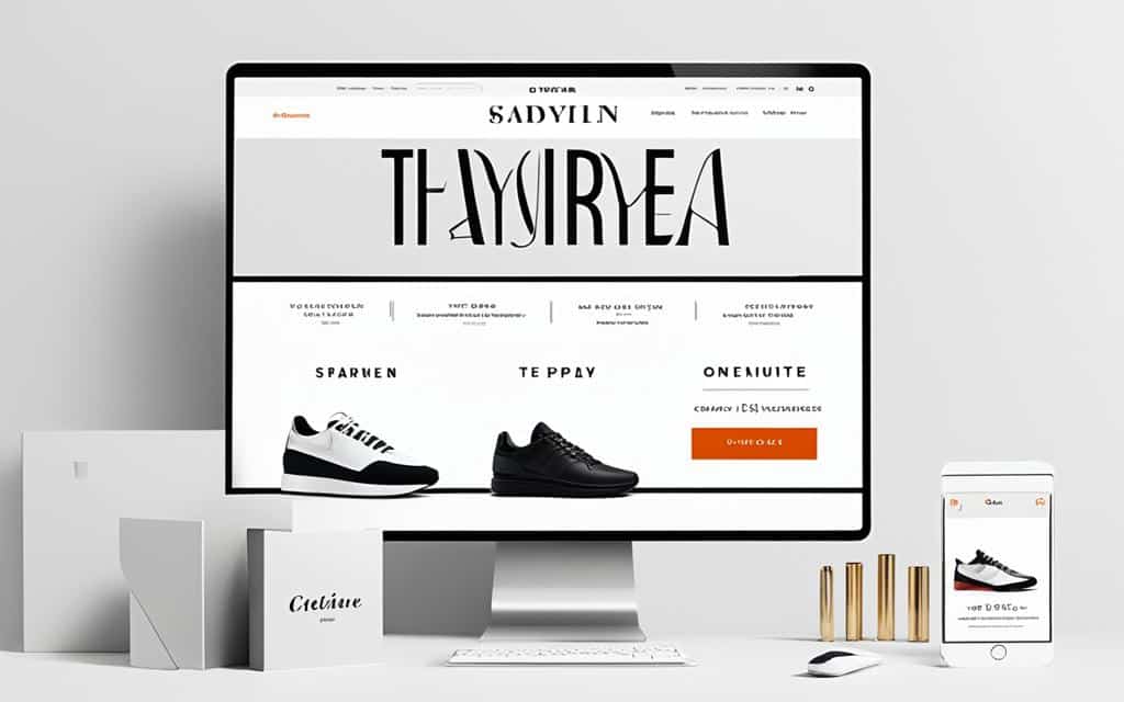
Typography plays a crucial role in the aesthetics of an e-commerce website, influencing a customer’s purchase decision. The design elements of a website, such as fonts, formatting, and overall visual appeal, can significantly impact user experience and engagement.
A study conducted at Blekinge Institute of Technology revealed that aesthetically pleasing website design resulted in higher purchase preferences among customers. This emphasizes the importance of considering typography as a key factor in e-commerce aesthetics.
The Power of Typography in Web Design
Typography in web design goes beyond mere font selection. It is the art of blending aesthetics and functionality harmoniously. Fonts play a crucial role in conveying a brand’s personality, evoking emotions, and guiding users through the content. When choosing fonts for web design, several factors need to be considered, such as readability, legibility, contrast, and consistency.
Readability refers to how easily the text can be read, while legibility focuses on the clarity of individual characters. The right combination of the two ensures that users can effortlessly consume the information presented. Contrast, on the other hand, allows for visual hierarchy and makes key elements stand out.
Consistency in typography creates a cohesive and professional look across the website. Selecting font families that work well together and maintaining consistent font sizes, line heights, and spacing is crucial for a visually appealing design.
Trends in typography, such as variable fonts and handwritten/custom fonts, can be leveraged to enhance the overall visual experience. Variable fonts offer flexibility by allowing designers to adjust weight, width, and other attributes dynamically. Handwritten or custom fonts add a personal touch and unique identity to the design.
“Typography is the detail and the presentation of a story. It represents the voice of an atmosphere, or historical setting of some kind.” – Milestone Marketing
–
Typography Trends
Web design constantly evolves, giving rise to new typography trends. One such trend is the use of variable fonts, which provide unprecedented control over the appearance of text. Variable fonts allow for seamless font morphing, enabling designers to create unique typographic experiences.
Another emerging trend is the use of handwritten or custom fonts. These allow brands to convey a sense of personality and authenticity. Handwritten fonts evoke a warm and personal feeling, while custom fonts provide a distinct visual identity.
Importance of Typography in Web Design
Typography plays a critical role in enhancing the user experience of a website. Well-thought-out typography can make content more engaging, increase readability, and contribute to overall user satisfaction.
When typography is carefully crafted, it aids in guiding users through the content and establishing a visual hierarchy. Headings, subheadings, and body text can be differentiated to facilitate scanning and improve content comprehension. This creates a seamless reading experience and helps users navigate the website with ease.
Moreover, typography can evoke emotions and establish a connection with users. Just like color, font styles have psychological effects. Choosing the right font can help elicit the desired emotional response from users and reinforce brand messaging.
Choosing the Best Fonts for Reading on Screen
When it comes to selecting fonts that are best for reading on screens, there are several important factors to consider. Distinctive and open letterforms are key elements that contribute to the legibility of fonts on various screen displays. Fonts such as Proxima Nova, Georgia, and Fira have been widely recognized for their readability and suitability for on-screen reading.
The font size, line height, and the contrast between the font and background color also play a crucial role in determining the readability of the text. It is important to ensure that the font size is neither too small nor too large, striking a balance between legibility and comfort for the reader. Similarly, the line height should provide enough space between lines to enhance readability without creating excessive gaps between the text.
To optimize the reading experience, the color contrast between the font and background should be carefully considered. A high contrast between the two improves readability, while a low contrast can strain the reader’s eyes. Testing the typography on different screens and display settings allows designers to fine-tune these factors and ensure optimal legibility across devices.
Overall, selecting the best fonts for reading on screen requires a thoughtful approach that takes into account letterforms, font size, line height, and contrast. By paying attention to these elements, designers can create visually appealing and reader-friendly digital content.
| Factors to Consider for Reading on Screen |
|---|
|
Formatting for a Pleasant Reading Experience
When it comes to web design, formatting plays a significant role in creating a pleasant reading experience for users. The way the text is presented on a webpage can greatly impact how easily it is read and understood. By making thoughtful decisions regarding line length, line height, font size, and font color, web designers can enhance the overall readability of their content.
One important aspect to consider is the line length. A line that is too long can strain the reader’s eyes and make it challenging to follow the text. On the other hand, a line that is too short can cause unnecessary line breaks, disrupting the flow of the content. Finding the right balance is crucial for a smooth reading experience.
The line height, or the vertical space between the lines of text, also affects readability. A sufficient line height ensures that the text is not cramped together, making it easier for readers to navigate through the content. It reduces visual fatigue and enhances the overall reading experience.
Choosing an appropriate font size is another key consideration. The font should be large enough to be easily readable, especially on small screens or devices. A font that is too small can strain the eyes and discourage users from engaging with the content. On the other hand, an excessively large font size may disrupt the overall visual balance of the webpage.
The choice of font color is equally important. The text should have sufficient contrast with the background color to ensure readability. For example, using a light-colored font on a light background or a dark-colored font on a dark background can create difficulties for users. It is essential to select a font color that stands out and provides clear visibility.
Tools for Formatting Decisions
Web designers can utilize various tools to help them make informed formatting decisions. One such tool is Grid Lover, which allows designers to test the relationship between line length, line height, and font size. By visually experimenting with these factors, designers can find the optimal balance for a pleasant reading experience.
Importance of Testing on Different Screens
Testing the typography on different screens and display settings is crucial to ensuring a successful design. The appearance and readability of the text can vary based on factors such as screen size, resolution, and brightness. It is essential to ensure that the chosen formatting choices are adaptable and maintain readability across various devices.
Overall, the formatting decisions made in web design have a significant impact on the reading experience of users. By carefully considering factors such as line length, line height, font size, and font color, designers can create visually appealing and easily readable content. Testing on different screens helps ensure that the formatting remains effective across various devices. By prioritizing a pleasant reading experience, websites can engage users and encourage them to stay longer on the page, ultimately contributing to the success of the website.
Conclusion
The role of typography in e-commerce website aesthetics cannot be underestimated. It has a significant impact on a customer’s purchase decision and overall user experience. When carefully selecting fonts, e-commerce businesses can create visually appealing and user-friendly online shops.
Formatting the text for optimal readability is also crucial. Considering factors such as line length, line height, font size, and font color greatly enhances the reading experience for visitors. Ensuring consistency in typography across the website helps maintain a cohesive and professional look.
In conclusion, typography plays a vital role in enhancing the aesthetics of e-commerce websites. By giving due attention to the selection of fonts, formatting decisions, and maintaining consistency, businesses can create visually captivating and user-friendly online stores that leave a lasting impression on their customers.
FAQ
How important is typography in e-commerce website aesthetics?
Typography plays a crucial role in influencing a customer’s purchase decision and creating a visually appealing online shop. It impacts the overall user experience and can lead to higher purchase preferences.
What is the significance of typography in web design?
Typography in web design goes beyond font selection. It helps convey the brand’s personality, evoke emotions, and guide the user’s journey through the content. It is a blend of aesthetics and functionality.
What factors should be considered when choosing fonts for reading on screens?
When selecting fonts for screen readability, factors such as distinctive and open letterforms should be considered. Fonts like Proxima Nova, Georgia, and Fira are known for their legibility on various screen displays. Font size, line height, and font and background color contrast also impact readability.
How important is formatting for a pleasant reading experience in web design?
Formatting decisions such as line length, line height, font size, and font color significantly impact the reading experience. Tools like Grid Lover can be used to test the relationship between these formatting decisions. Selecting a background color that contrasts well with the font color is also essential for readability.
What is the conclusion regarding the role of typography in e-commerce website aesthetics?
Typography has a significant impact on a customer’s purchase decision and overall user experience in e-commerce websites. By selecting the right fonts, formatting the text for optimal readability, and ensuring consistency, businesses can create visually appealing and user-friendly online shops.


