Table of Contents
In today’s digital age, creating an impressive and user-friendly e-commerce website is essential for online retail aspirations. To help you kickstart your journey, we have curated a list of the best e-commerce websites examples that will inspire you to create a stunning online platform for your products or services. These websites have not only mastered the art of captivating design but also excel in user experience, brand communication, and overall functionality.
From sleek and minimalist interfaces to bold and vibrant color schemes, these e-commerce websites exemplify the key elements required for a successful online retail platform. Through the use of striking product photography, engaging copywriting, and interactive features, these examples set the bar high for aspiring e-commerce entrepreneurs.
Whether you are drawn to clean and modern aesthetics or prefer an unconventional and creative approach, these examples will provide the much-needed inspiration to elevate your own e-commerce website. Now, let’s delve into these outstanding examples and discover the secrets behind their success!
Thesus (formerly Alice + Whittles)
The Thesus e-commerce website design, formerly known as Alice + Whittles, captivates visitors with its focus on timeless, high-quality footwear. The clean and minimalist design creates a seamless browsing experience, allowing the products to take center stage.
Thesus’ emphasis on product photography showcases their footwear in a visually appealing manner, conveying the quality and beauty of their offerings. The carefully curated images highlight the intricate details and craftsmanship of each pair of shoes, enticing potential customers.
One of the key features of Thesus’ website design is its commitment to customer satisfaction. They proudly offer free shipping, making their products accessible to a wider audience. Additionally, their free returns policy instills confidence in buyers, ensuring a hassle-free shopping experience.
A standout feature that differentiates Thesus is its interest-free installment plan. This payment option provides flexibility, allowing customers to spread the cost of their purchase over multiple installments without incurring any additional charges. This offering caters to customers who may prefer to pay in smaller increments.
The Thesus website design exemplifies the power of clean design and the effective use of product photography. The focus on quality, free shipping, free returns, and interest-free installment plans builds trust and encourages visitors to become loyal customers.
Thesus e-commerce website captures attention through its clean design, putting their high-quality footwear in the spotlight. The use of product photography is key, showcasing the intricate details and craftsmanship of their shoes. With free shipping, a free returns policy, and an interest-free installment plan, Thesus builds trust with its customers from the moment they land on the website.
Allbirds
Allbirds, the popular apparel store, stands out for its commitment to sustainability and eco-conscious practices. Their website design reflects these values, creating a seamless and engaging user experience. By using high-quality photos of their apparel in action, Allbirds effectively showcases the functionality and style of their products.
One of the key elements of Allbirds’ website design is their compelling copy. They emphasize what sets them apart from other brands in the industry, with phrases like “Break a sweat, not the planet” and “running shoes made with natural materials.” This copy positions Allbirds as a leader in eco-friendly fashion and resonates with environmentally conscious consumers.
To further build trust with visitors, Allbirds prominently displays their Certified B Corporation badge. This certification verifies that Allbirds meets rigorous standards for social and environmental performance, accountability, and transparency. The Certified B Corporation badge adds credibility to Allbirds’ sustainability claims and appeals to consumers who prioritize ethical shopping.
Allbirds’ website design not only focuses on aesthetics and sustainability but also ensures a smooth shopping experience. The simplicity of their call-to-action prompts makes it easy for users to navigate the site and make purchase decisions quickly. From browsing the latest styles to adding items to the cart, the intuitive design streamlines the entire purchasing process.
“Break a sweat, not the planet” – Allbirds
Allbirds’ commitment to sustainability, coupled with their appealing website design, has positioned them as a leader in the eco-friendly fashion industry. Their attention to detail in showcasing their products, compelling copy, and emphasis on seamless user experience sets them apart from their competitors.
Why Allbirds Stands Out:
- High-quality photos showcasing their sustainable apparel
- Compelling copy that highlights their eco-friendly mission
- Prominent display of their Certified B Corporation badge
- Simple and intuitive call-to-action prompts for easy shopping
By using design and copy to effectively communicate their sustainability efforts, Allbirds has attracted a dedicated customer base. Their website design serves as a prime example of how an e-commerce store can successfully align with eco-conscious values while providing a seamless shopping experience.
Azteca Soccer
Azteca Soccer offers a truly unconventional website design, giving visitors an immersive boutique experience rather than a typical online store format. With their unique approach, the brand aims to create a more personal and engaging shopping journey.
Unlike traditional online retailers, Azteca Soccer uses captivating lifestyle shots throughout their website. These images go beyond showcasing the products and allow customers to envision the items in real-life settings, creating a strong connection with the brand and products.
This innovative design choice aligns with Azteca Soccer’s commitment to providing a boutique experience. By combining lifestyle shots with product images, they create a visually appealing and inspiring atmosphere that goes beyond the mere transactional aspect of online shopping.
Using unconventional website design, Azteca Soccer challenges the status quo and sets itself apart from competitors. This approach not only captures the attention of visitors but also enhances their overall shopping experience, making it more memorable and enjoyable.
The Power of Lifestyle Shots in E-Commerce
“Lifestyle shots enable customers to visualize products in real-life scenarios, fostering a sense of connection and desire.”
The use of lifestyle shots in e-commerce has become increasingly popular due to its ability to create an emotional impact on customers. By incorporating these images, Azteca Soccer brings their products to life, allowing customers to see how they can fit seamlessly into their own lifestyles.
Through unconventional website design and the inclusion of lifestyle shots, Azteca Soccer elevates the online shopping experience, providing a unique and compelling browsing journey for their customers.
| Benefits of Azteca Soccer’s Unconventional Design |
|---|
| Enhanced immersion and personalization |
| Stronger emotional connection with customers |
| Memorable and enjoyable shopping experience |
| Unique brand differentiation |
Bliss
Bliss, a skincare brand known for its bright and vibrant products, has created an engaging and energetic website design to match its fun energy. Powered by BigCommerce, their website uses a bold color scheme to create a lively atmosphere that captures the attention of visitors.
The use of bright colors throughout the website adds a vibrant touch to the overall design, reflecting the brand’s commitment to creating joyful and uplifting skincare experiences. The cheerful color palette instantly creates a positive and welcoming first impression, making visitors feel excited to explore the products.
Bliss understands the importance of creating an enjoyable shopping experience, and their engaging design reflects this. The website incorporates interactive elements that encourage visitors to interact with the brand and discover more about their range of skincare products.
The Benefits of Bliss’s Engaging Design
- Creates a fun and energetic atmosphere
- Reflects the brand’s bright and vibrant product range
- Utilizes interactive elements to engage visitors
- Provides an enjoyable shopping experience
Bliss’s website design is not only visually appealing but also highly functional. The easy navigation allows visitors to explore the various skincare products effortlessly. Whether customers are looking for brightening serums, hydrating moisturizers, or nourishing masks, they can easily find what they need with just a few clicks.
The engaging design of Bliss’s website showcases the brand’s dedication to creating skincare products that not only deliver results but also bring joy and bliss to their customers’ lives.
| Benefits of Bliss’s Website Design | Description |
|---|---|
| Bright Colors | The use of vibrant colors creates an energetic atmosphere and reflects the brand’s fun energy. |
| Engaging Design | Interactive elements encourage visitors to explore and interact with the brand, making the shopping experience enjoyable. |
| Easy Navigation | The intuitive navigation allows customers to find their desired skincare products quickly and effortlessly. |
Bon Bon Bon
Bon Bon Bon’s website design is a visual feast that perfectly encapsulates the creativity and spirit of their artisanal chocolates. From the moment visitors land on the site, they are greeted with a bold and vibrant display of colors that instantly captures attention and sets the tone for a fun and interactive browsing experience.
The clever use of color throughout the website helps to communicate the brand’s unique identity and establishes a strong visual presence. Each page is filled with delightful hues that reflect the variety and artistry of Bon Bon Bon’s chocolates, making the experience not only delicious but visually captivating as well.
The creativity doesn’t stop at the color palette. Bon Bon Bon’s website design features interactive elements that encourage visitors to engage and interact with the content. Whether it’s through playful animations, hidden surprises, or gamified features, the website ensures that every visitor is entertained and delighted.
Harnessing the power of creativity, Bon Bon Bon’s website presents their artisanal chocolates in a way that is not only visually enticing but also communicates the brand’s dedication to craftsmanship and quality. The use of color, interactive elements, and overall design aesthetic all contribute to an unforgettable browsing experience that leaves a lasting impression.
Chubbies
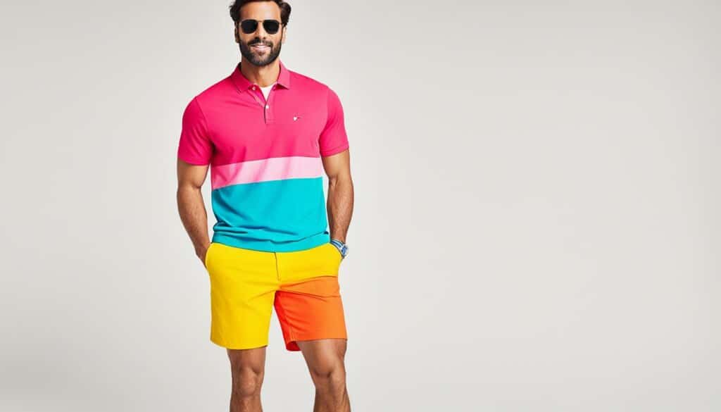
Chubbies, known for their colorful shorts, has a website design that perfectly reflects the vibrant nature of their products. The use of bright and eye-catching colors immediately catches the attention of visitors, creating an energetic and lively atmosphere from the moment they land on the site. The clever and witty copy used throughout the website effectively communicates the brand’s values and creates a strong sense of connection with the audience.
Chubbies’ website design is a visual feast, with images of their colorful shorts prominently displayed. The website layout is clean and modern, making it easy for visitors to navigate and find what they’re looking for. Whether it’s browsing the latest summer collection or exploring the various styles available, the website’s design ensures a seamless and enjoyable user experience.
The clever use of copy adds an element of fun and personality to the brand. From catchy headlines to humorous product descriptions, Chubbies’ website engages visitors with clever wordplay and a distinct tone of voice. This attention to detail in their copywriting further reinforces their brand values and sets them apart from their competitors.
The Importance of Website Design
In the competitive world of e-commerce, a well-designed website plays a crucial role in attracting and retaining customers. Chubbies understands this and has crafted a website that not only showcases their colorful shorts but also embodies their brand identity and values. The combination of vibrant colors, clever copy, and a user-friendly interface creates a memorable and engaging online shopping experience for visitors.
Chubbies’ website design reflects their brand values, using bright colors and clever copy to create a sense of connection with customers.
When visitors land on the Chubbies website, they are immediately greeted with a visual display of the brand’s colorful shorts. This immediate immersion in their product range captures the attention of potential customers and ignites curiosity. The website’s design effectively showcases the various styles, sizes, and patterns available, making it easy for customers to find exactly what they’re looking for.
Chubbies’ commitment to their brand values is evident throughout the website. From the bold color choices to the playful and witty copy, every element is carefully crafted to create an unforgettable brand experience. This attention to detail and consistency in design contributes to building trust and reinforcing the brand’s values among customers.
In summary, Chubbies’ website design is a testament to their commitment to creating a memorable and engaging online shopping experience. Through vibrant colors, clever copy, and a user-friendly interface, Chubbies effectively communicates their brand values and creates a strong connection with their audience. Their website design serves as an inspiration for e-commerce businesses looking to showcase their products and build a strong brand identity.
Crossrope
Crossrope’s website design aims to introduce visitors to a fun fitness experience. The video feature on their homepage allows them to showcase their product firsthand and engage users through interactive elements. It effectively communicates the unique fitness experience their product offers.
By incorporating engaging design elements, such as interactive videos, Crossrope creates an immersive fitness experience for users. The informative approach of their website allows visitors to learn about the benefits and features of their innovative jump ropes and fitness programs.
With Crossrope, users can take their fitness routine to the next level. The engaging design and informative content on their website make it easy for visitors to understand how their products can enhance their workout routines.
The combination of video demonstrations, product descriptions, and customer testimonials showcases the effectiveness of Crossrope’s fitness products. The informative approach helps users make informed decisions and encourages them to embark on their fitness journey with confidence.
The Benefits of Crossrope:
- Fun and engaging fitness experience
- High-quality jump ropes and fitness programs
- Informative videos for product demonstrations
- Customer testimonials for added credibility
- Easy navigation for a seamless browsing experience
| Feature | Description |
|---|---|
| Engaging Design | Crossrope’s website design captures the attention of visitors with its dynamic layout and interactive videos. |
| Video Demonstrations | Informative videos showcase the proper techniques and exercises that can be done with Crossrope’s jump ropes. |
| Customer Testimonials | Real-life success stories from customers inspire and motivate visitors to achieve their fitness goals. |
| Easy Navigation | The website’s intuitive navigation allows users to explore different product options and find the information they need quickly. |
With its unique combination of engaging design, video demonstrations, and informative content, Crossrope’s website provides an enjoyable and informative fitness experience for users.
Cruisemaster
Cruisemaster’s website design takes an informative approach, placing a strong emphasis on showcasing the numerous benefits of their products. Through the use of well-designed banners and informative boxes, they effectively communicate the unique advantages their range offers to potential customers.
The website design goes beyond mere aesthetics to ensure easy navigation for visitors, allowing them to explore the diverse range of products effortlessly. The seamless user experience enhances engagement and encourages users to discover the benefits each product has to offer.
Emphasizing Diversity
Cruisemaster’s website design prioritizes diversity, showcasing the wide range of products available to cater to different customer preferences. From versatile models suitable for off-road adventures to compact designs for urban exploration, their product diversity ensures that customers find the perfect fit for their needs.
Cruisemaster celebrates and highlights the various features and capabilities of each product, guiding customers towards the best options for their specific requirements. This approach underscores their commitment to providing a comprehensive and inclusive offering.
Informative Product Benefits
One of the key strengths of Cruisemaster’s website design is its focus on presenting the specific benefits of their products. With informative content, they educate potential buyers about the unique advantages and features that set their brand apart.
Whether it’s through highlighting the superior durability, exceptional performance, or innovative technology incorporated into their products, Cruisemaster ensures that customers are well-informed and confident in their purchase decision. The informative approach goes beyond mere marketing to empower customers with knowledge.
“Cruisemaster’s commitment to diversity and informative product representation creates a user experience that is both inclusive and empowering.”
By prioritizing informative website design and emphasizing diversity, Cruisemaster demonstrates their dedication to delivering quality products that cater to a wide range of customer needs. The user-friendly interface and comprehensive product benefits showcased on their website position them as a reliable and trustworthy brand within the industry.
Cutter & Buck
Cutter & Buck is renowned for its easy navigation and design emphasis, which significantly enhances the browsing experience and overall user satisfaction. The website’s simplicity allows visitors to effortlessly explore the diversity of products and categories available, enabling them to find what they need quickly and efficiently.
| Benefits of Cutter & Buck’s Website Design |
|---|
| 1. Easy Navigation: The website’s intuitive interface and structured layout make it a breeze for customers to navigate through the product range and find their desired items. |
| 2. Design Emphasis: Cutter & Buck’s website design prioritizes visual appeal, ensuring that the products are displayed in an aesthetically pleasing manner. The design elements enhance the overall user experience and draw attention to the brand’s attention to detail. |
| 3. Product Range Diversity: With a wide variety of products available, Cutter & Buck’s website design effectively showcases the diverse range, ensuring that customers can easily locate the specific items they are looking for. |
The combination of easy navigation, design emphasis, and product range diversity sets Cutter & Buck’s website apart as a prime example of a well-designed e-commerce platform. It caters to the needs of customers, providing them with a seamless and enjoyable online shopping experience.
Decibullz: Showcasing Quality with Larger Images
Decibullz, an innovative brand in the audio industry, has crafted a website design that captivates visitors with striking visuals and an engaging user experience. By effectively utilizing larger images, Decibullz showcases their high-quality products and entices potential customers. This approach not only highlights the intricate details of their audio devices but also creates a visually immersive browsing experience.
The design of the Decibullz website is characterized by a sleek black and white theme, enhanced by contrasting colors that create a visually appealing aesthetic. The intentional use of these colors contributes to the overall professionalism and sophistication of the site, while also allowing the call-to-action buttons to stand out prominently. This effective use of contrasting colors guides visitors towards key actions, such as making a purchase or signing up for newsletters, ensuring a seamless and engaging customer journey.
The fast and reliable nature of the Decibullz website further enhances the user experience. With quick loading times and seamless navigation, visitors can effortlessly explore the range of audio products and make informed purchasing decisions. As a result, Decibullz effectively establishes itself as a trusted brand in the competitive audio market.
The Decibullz website design stands as an impressive example of the effective use of larger images, a black and white design with contrasting colors, and well-placed call-to-action buttons. By combining attractive visuals, a user-friendly interface, and a captivating browsing experience, Decibullz successfully converts visitors into satisfied customers.
Dick Moby
Dick Moby’s website design integrates captivating colors, stunning photography, and playful elements to deliver a browsing experience like no other. The fusion of these visual elements creates a distinctive and engaging interface that resonates with visitors.
Through carefully chosen color palettes, Dick Moby’s website design evokes a sense of style and individuality. The vibrant hues and harmonious combinations bring excitement and energy to the brand’s message.
The website design places a strong emphasis on photography to showcase Dick Moby’s eco-conscious eyewear. High-quality images capture the attention of users and effectively communicate the brand’s commitment to sustainability. Each image tells a story, inviting visitors to explore the world of Dick Moby.
Incorporating fun elements throughout the website design enhances user engagement. Interactive features, playful animations, and unexpected surprises add a touch of delight and make the browsing experience enjoyable and memorable.
The website design also leverages compelling copy to emphasize Dick Moby’s brand story and target audience. Through authentic and informative content, the brand conveys its values, craftsmanship, and dedication to creating sunglasses that reflect a conscious lifestyle.
“At Dick Moby, we believe that fashion and sustainability can go hand in hand. Our eyewear not only makes a style statement but also contributes to a cleaner environment. Join us on our journey toward a more sustainable future.”
By merging captivating color schemes, captivating photography, and delightful fun elements, Dick Moby’s website design captures the attention and hearts of visitors. It effectively communicates the brand’s eco-conscious message and leaves a lasting impression, inspiring individuals to make more sustainable choices.
| Website Design Features | Description |
|---|---|
| Color | Captivating and vibrant color palettes that convey style and individuality. |
| Photography | High-quality images that highlight Dick Moby’s eco-conscious eyewear and tell a captivating story. |
| Fun Elements | Interactive features, playful animations, and surprises that enhance user engagement and enjoyment. |
| Brand Story | Informative and authentic copy that emphasizes Dick Moby’s values, craftsmanship, and commitment to sustainability. |
Frank Body
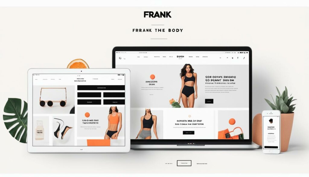
Frank Body’s website design embodies an authentic brand voice that targets a fun and young audience. From its engaging copywriting to its visually striking monochromatic scheme, the website showcases the power of a unique brand voice in capturing attention and retaining a loyal customer base.
With its authentic brand voice, Frank Body establishes a genuine connection with its audience. The website’s copywriting exudes a playful and relatable tone, making visitors feel like they are interacting with a friend rather than a faceless brand. By incorporating colloquial language and witty messaging, Frank Body creates an immediate sense of familiarity and builds trust.
Targeting a fun and young audience, Frank Body’s website design is visually appealing and on-trend. The monochromatic scheme, predominantly black and white with pops of bold colors, creates a sleek and modern aesthetic that resonates with its target demographic. The use of vibrant product imagery and minimalistic design elements adds to the overall visual impact, ensuring a memorable browsing experience.
As a brand known for its body scrubs and skincare products, Frank Body’s engaging website design effectively showcases its range of offerings. The product pages feature high-quality images that highlight the textures and benefits of each product, enticing customers to explore further. The website’s intuitive navigation and clear calls-to-action make it easy for visitors to browse, learn about the products, and make a purchase.
Frank Body’s website design is a prime example of how an authentic brand voice and a visually appealing monochromatic scheme can create a memorable and engaging browsing experience. It serves as a source of inspiration for copywriting and demonstrates the importance of staying true to your brand’s personality to connect with your target audience.
| Key Features of Frank Body’s Website Design |
|---|
| An authentic brand voice that connects with a fun and young audience |
| A visually striking monochromatic scheme with pops of bold colors |
| Engaging copywriting that creates a playful and relatable tone |
| High-quality product imagery that showcases the textures and benefits of each product |
| Intuitive navigation and clear calls-to-action for easy browsing and purchases |
Fronks
Fronks’ website design embodies the essence of clean design, product focus, interactive elements, and modern simplicity. With its sleek and minimalist aesthetic, Fronks prioritizes the presentation of their products, allowing them to take center stage. The website’s clean layout and intuitive navigation make for a seamless browsing experience, ensuring that visitors can easily explore the range of offerings.
One key aspect of Fronks’ design is the strategic use of interactive elements. These elements pique the curiosity of visitors, enticing them to engage and delve deeper into the brand’s offerings. Whether it’s a hover effect that reveals additional product details or a click-through interaction that showcases different angles of a product, the interactive elements add an element of interactivity and excitement to the website.
Furthermore, Fronks’ modern simplicity is reflected in the overall design aesthetic. The use of ample white space and minimalistic typography creates a sense of elegance and sophistication. By utilizing a clean design approach, Fronks ensures that the product images and descriptions are the focal points, allowing customers to make informed decisions and fully appreciate the quality of their offerings.
All in all, Fronks’ website design encapsulates the essence of clean and modern design, with a strong focus on the products themselves. The interactive elements add an element of interactivity, captivating visitors and encouraging them to explore further. With its modern simplicity, Fronks delivers a visually appealing and intuitive website that effectively showcases the brand’s identity and offerings.
Hebe
Hebe’s website design captivates visitors with its high-quality product photos that place the products in the spotlight. Each photo is carefully crafted to highlight the unique features and details of the products, allowing customers to make informed purchasing decisions. These stunning visuals create a visual experience that enhances the overall appeal of the website.
One notable aspect of Hebe’s website design is the use of an unusual font for the typography. This unconventional choice not only adds visual interest but also contributes to brand recognition. The font reflects the brand’s distinctive personality and helps establish a memorable identity in the minds of visitors.
The website design focuses on product-centric navigation, making it easy for customers to explore and find what they need. The streamlined layout and intuitive user interface ensure a seamless and enjoyable browsing experience, enhancing customer satisfaction and conversion rates.
Hebe’s commitment to brand recognition is evident through their deliberate product focus. The design elements and layout of the website are strategically arranged to draw attention to the products and guide customers towards the purchase journey. By keeping the focus on the products, Hebe enhances the overall shopping experience and reinforces their commitment to delivering high-quality products.
Overall, Hebe’s website design exemplifies the power of high-quality product photos and an unusual font to create a visually captivating and memorable online presence. The combination of these elements, along with the brand’s clear product focus and commitment to brand recognition, positions Hebe as a leader in their industry.
Home Science Tools
Home Science Tools is a website that is designed with the user in mind. It offers well-organized categories and custom elements that make it easy for visitors to find new science projects. Whether you’re a student, teacher, or science enthusiast, Home Science Tools provides a user-friendly experience that allows you to navigate the website effortlessly and discover a variety of exciting science projects.
With its easy navigation and intuitive interface, Home Science Tools ensures that finding the perfect project is a breeze. The website’s well-organized categories allow users to explore different areas of science, ranging from chemistry to physics to biology. Whether you’re interested in conducting experiments, building models, or exploring the wonders of the natural world, Home Science Tools has something for everyone.
One of the standout features of Home Science Tools is its commitment to customization. The website offers custom elements that allow users to personalize their browsing experience. From saving favorite projects to creating custom lists, Home Science Tools empowers users to tailor the website to their specific interests and needs.
“Home Science Tools offers a truly unique and immersive experience for science enthusiasts of all ages. The well-organized categories and custom elements make it easy to explore and discover new science projects, while the user-friendly design ensures a seamless navigation experience.”
Furthermore, Home Science Tools understands the importance of visual representation in a science-focused website. The use of engaging visuals and informative descriptions enhances the user experience and makes science more accessible and exciting. Whether it’s through captivating images or detailed diagrams, each project on Home Science Tools is presented in a visually appealing and easy-to-understand manner.
Featured Science Projects
| Project | Description |
|---|---|
| Lava Lamp | Create a mesmerizing lava lamp using household materials. This project explores principles of density and chemical reactions. |
| Balloon Rocket | Build a balloon rocket and learn about the laws of motion and propulsion. |
| Crystal Growing Kit | Grow your own dazzling crystals with this kit. Explore the science of crystal formation and observe the beauty of nature. |
| Solar Oven | Construct a solar-powered oven and harness the energy of the sun to cook delicious treats. |
The table above showcases just a few examples of the exciting science projects available on Home Science Tools. Whether you’re looking to conduct experiments, explore the natural world, or engage in hands-on learning, Home Science Tools provides a vast array of projects that cater to all interests and skill levels.
With its well-organized categories, custom elements, and easy navigation, Home Science Tools is the go-to destination for science enthusiasts. Unleash your curiosity, embark on new scientific adventures, and ignite your passion for learning with Home Science Tools.
Conclusion
In conclusion, these examples of best e-commerce website designs provide inspiration and insight into the key elements of effective online retail platforms. From clean and minimalist designs to bold and vibrant color schemes, these websites showcase the importance of visual appeal, user experience, and effective communication of brand values.
By incorporating visually appealing product photography, compelling copywriting, and interactive elements, these designs offer valuable lessons for anyone looking to create a successful e-commerce website. The showcased websites demonstrate the power of engaging visitors through seamless navigation, showcasing product range diversity, and integrating brand values into the design.
Creating an engaging e-commerce website requires careful attention to detail and an understanding of the target audience. The websites highlighted in this article have mastered the art of capturing the essence of their brand through effective website design, providing a seamless customer experience and leaving a lasting impression on visitors.
Whether you’re just starting out or looking to revamp your existing e-commerce platform, taking inspiration from these successful designs can help you achieve a visually appealing, user-friendly, and effective online retail presence that sets you apart from the competition.
FAQ
Where can I find examples of best e-commerce website designs for inspiration?
You can find examples of the best e-commerce website designs for inspiration in this curated list that showcases 25 top websites in 2024. These examples provide insights into unique design elements, use of photography, typography, and overall user experience.
What is Thesus (formerly Alice + Whittles) known for in terms of website design?
Thesus’ website design focuses on showcasing their timeless, high-quality footwear through minimalistic product photography and clean design. They effectively communicate the value and quality of their products while highlighting their free shipping, free returns policy, and interest-free installment plan to build trust among visitors.
How does Allbirds use their website design to emphasize their brand values?
Allbirds’ website design is centered around sustainability and being eco-conscious. They use high-quality photos of their apparel in action and focus on what sets them apart through their copy, such as “Break a sweat, not the planet” and “running shoes made with natural materials.” They also emphasize their Certified B Corporation badge to build trust. The simplicity of their call-to-action prompts makes shopping easy.
How does Azteca Soccer differentiate their website design from traditional online stores?
Azteca Soccer takes a unique approach to their website design by offering visitors a boutique experience instead of a traditional online store feel. They use lifestyle shots instead of just product images to create a more immersive and personal shopping experience.
What design elements make Bliss’s website design engaging for visitors?
Bliss’s website design, powered by BigCommerce, uses bright colors to create a fun and energetic atmosphere. The use of vibrant colors and interactive elements effectively communicates the spirit and creativity of the company. It engages visitors and makes the shopping experience cheerful and enjoyable.
How does Bon Bon Bon use color and design to enhance their brand image?
Bon Bon Bon’s website design is bold and vibrant, effectively capturing the creativity and spirit of their artisanal chocolates. The use of color throughout the website helps communicate the company’s brand and create a fun and interactive browsing experience for visitors.
How does Chubbies use their website design to connect with visitors?
Chubbies’ website design embraces vibrant colors, reflecting the colorful shorts they sell. The website’s clever and witty copy effectively communicates the values of the brand and creates a sense of connection with visitors.
How does Crossrope’s website design engage users in a fitness experience?
Crossrope’s website design aims to introduce visitors to a fun fitness experience. The use of video on their homepage allows them to showcase their product firsthand and engage users through interactive elements. It effectively communicates the unique experience their product offers.
How does Cruisemaster prioritize information in their website design?
Cruisemaster’s website design takes an informative approach, emphasizing the benefits of their products through elements such as banners and boxes. The design effectively showcases the diversity of their range and provides easy navigation for visitors.
Cutter & Buck’s website design focuses on easy navigation and emphasizes the diversity of their product range. The simplicity of the design enhances its effectiveness in highlighting the different products and categories available.
How does Decibullz use design elements to create an engaging browsing experience?
Decibullz’s website design uses larger images effectively, showcasing their products with a fast and reliable website. The black and white design with contrasting colors allows the call-to-action buttons to stand out, providing a visually appealing and engaging browsing experience.
What design elements make Dick Moby’s website design unique and engaging?
Dick Moby’s website design combines color, photography, and fun elements to create a unique and engaging browsing experience. The website design effectively communicates the brand’s eco-conscious message and uses copy to emphasize the brand story and target audience.
What makes Frank Body’s website design visually striking and appealing?
Frank Body’s website design uses an authentic brand voice aimed at a fun and young target audience. The design incorporates a monochromatic scheme, making it visually striking and appealing. The website provides inspiration for copywriting and showcases the power of a unique brand voice.
What design elements make Fronks’ website design effective in highlighting their products?
Fronks’ website design focuses on clean, modern, and simple design to highlight their products. The use of interactive elements and partial product displays intrigue visitors, creating a desire to explore further. The design effectively showcases who Fronks is as a brand.
How does Hebe use their website design to emphasize their products?
Hebe’s website design stands out with high-quality product photos that make the products the main focus. The use of an unusual font helps with brand recognition and adds to the overall visual appeal of the website.
What design elements make Home Science Tools’ website user-friendly?
Home Science Tools’ website design focuses on well-organized categories and custom elements to make it easy for visitors to find new science projects. The design is user-friendly and showcases the variety of products available, highlighting that good website design is not complicated.

